

I conducted comparative research using SWOT analysis to evaluate similar companies, identifying strengths and areas for improvement. In addition, I interviewed five frequent online shoppers aged 26–60 to better understand their shopping behaviors and expectations about store and name brand items.
To better understand the landscape and identify design opportunities, I conducted a competitive analysis of Target, Walmart, Amazon, and Lowe’s. I focused on how each brand presents its private label products and how they support product comparison online.
While conducting interviews, my goal was to understand how real users make purchasing decisions and whether they currently use any product comparison tools:
A clear understanding of business and user goals, paired with technical considerations, allowed me to outline critical product needs and proactively address potential limitations. I had to keep in mind the business goals of selling the product and maintaining user goals of ease and clarity while also considering the technical considerations this would take on Target's website.

Currently people who shop find it hard to easily compare products of different brands. This is because it is up to the person to do it themselves which can become time consuming. As a result, they do not make meaningful and efficient comparisons to make an informed decision.
Based on research and interview findings, I focused on showcasing all the possibilities on how the user can arrive on the product page and how often they could interact with the comparison tool.

The findings from interviews and research, I was able to come up with two personas that visualizes the diverse group of people this product would impact and showcasing their brand affinity. I focused on a savings/deal focused shopper and a brand loyalist who wants to branch out to cheaper products.

I sketched out layouts and digitally created wireframes of the one that I think would have worked the best. I created a simple prototype and used the same participants as the interview in order to gain early design feedback.
The tasks were scroll, "X" out a product, and compare as these would be the main functions of the tool. All five of the participants were able to go through the wireframe prototype with no errors

Since I was designing for an existing brand, my goal was to ensure the feature felt native to Target’s website. To stay consistent with their visual identity, I uploaded Target’s style tile into my Figma file and designed using the same UI elements and patterns.
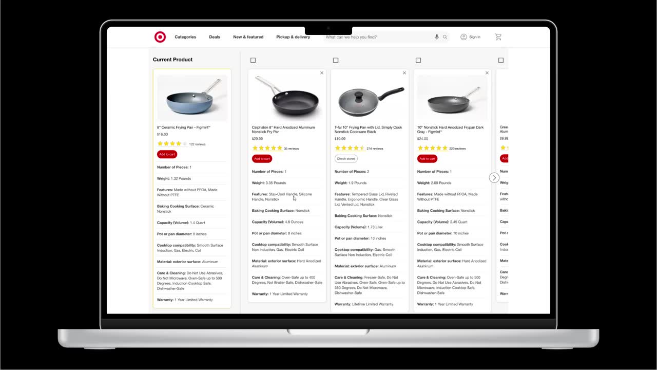
Based on user testing, there were no changes needed for high fidelity. I incorporated the logo, colors, and UI elements to create a high fidelity mockup that is in line with Target's identity.
.png)
.png)
.png)
I created a prototype from my high fidelity design in Figma using a laptop device mockup. This prototype was sent out to the same participants as in the interview and first testing. All participants were able to complete the task within 15 minute time frame with no errors.
Based on user testing, not many changes needed for the final deliverable; I updated the prototype to make it a smoother experience by using smart animate as the transition between screens.
I enjoyed working through this design as it offered me experience with an already established brand. There was some points when designing the final high fidelity screens that were tough because I had to keep that brand identity in tact but I feel achieved with the final result; especially when the participants commented on how it looks like it could be a part of Target's website.
If you like what you see and want to work together, get in touch!
nickgonzo615@gmail.com