


I used comparative research with similar companies using SWOT analysis and user interviews with five people with an age range of 26-60 who frequently online shop through websites or apps.
To better understand the landscape of casual breakfast restaurants and identify opportunities for improvement, I conducted a competitive analysis of IHOP, Denny’s, and Perkins. I focused on how each brand presents its offerings online—especially their menus, ordering experiences, and local relevance.
Strengths:
Weakness:
I interviewed five participants who frequently order food online. My goal was to understand how digital presence influences where they choose to eat and what factors matter most in their decision-making.
A clear understanding of business and user goals, paired with technical considerations, allowed me to outline critical product needs and proactively address potential limitations. For a local business, I had to focus on realistic limitations they may come across. The most important part is a fast loading, easy to use, informational website that draws in more consumers.

Currently, some small restaurants either don’t have a website or very limited online presence. This is because as a small business, they might not have time or resources to create one. As a result, potential customers do not get accurate information or have online trouble resulting in user frustration.
Drawing from research and user interviews, I designed a clear and intuitive journey that takes users from the homepage all the way to a seamless checkout experience. By understanding the user journey, it helped me focus on what other successful websites have done as well as help me ideate some designs.

After sketching several layout ideas, I selected the most promising concept to develop into a digital wireframe. I then built a basic prototype and conducted usability testing with the original interview participants to collect early design feedback.
I focused on previous experience going through website designs and decided on the common themes a successful one has: easy navigation bar and informational sections to give a new user said information right away. I also chose to include images of menus to give user what the item would be without having to read descriptions/ingredients.


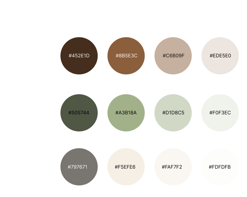
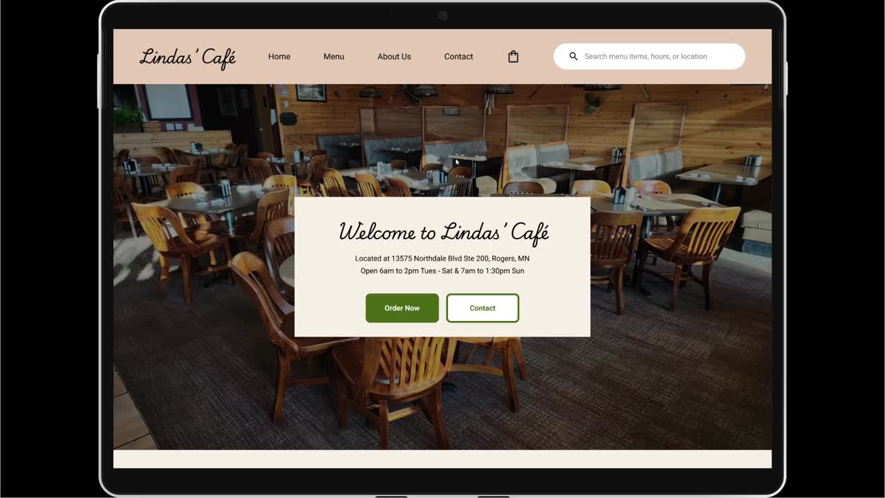
Since the business lacked a website and brand identity, I established one by selecting earthy tones of brown and green to communicate a cozy, diner-like aesthetic. I paired this with the Playwright cursive font in the logo to emphasize its local charm.
Based on user testing, I changed the informational of the café to be included in the hero image, instead of under weekly sections. I was able to incorporate my color scheme and typography to high fidelity screens to get ready for more testing.
I created a prototype from my high fidelity design in Figma for both mobile and desktop layout. This prototype was sent out to the same participants as in the interview and first testing. All participants were able to complete the task within 15 minute time frame with no errors.

Based on feedback only one major change needed to be made: adding calories to the menu items. There were some minor revisions where I cleaned up some negative space and made the prototype a smoother experience.
.png)

This experience gave me the opportunity to design a website for both desktop and mobile, which was both exciting and challenging. Adapting my designs to fit the constraints of mobile, after initially working with the flexibility of a wider desktop layout, was difficult at first. But by the end of the project, I found myself able to shift between the two layouts more naturally and intuitively.
If you like what you see and want to work together, get in touch!
nickgonzo615@gmail.com